| JEFF WOODHOUSE | |
Jeff caught his first fish at the age of five, a mackerel from a Torquay fishing boat. That was the starting point 55 years ago and the sight of that living silvery image coming up from the invisible depths had him hooked for life. Since then he has practised virtually every type of fishing, although not always successfully. He doesn’t just like fish, he has a love affair with them, in his living room, in his garden and at times, in his freezer. Lately he has spent more time either running clubs or assisting them to become successful. Now he admits to being too old to chase monsters, he’s happier getting as much fun as possible out of what’s before him. In this monthly series Jeff indulges the rebel within himself, often controversial and always trying to think differently about the usual trends in fishing. |

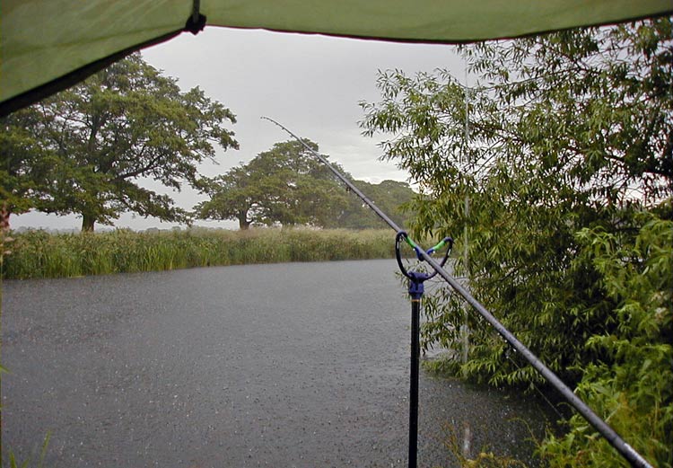
| Peter’s Calendar Competition The appalling weather is once again curtailing good fishing, for me at least, but I see Mr. Jacobs has put up some prize money for a new photographic competition. That’s very nice of him (really, I’m not being bitchy) and he will judge the winners whose pictures will also go forward to the production of a new FISHINGmagic calendar. If this calendar is going to be successful, the standard of entries has to be high. That doesn’t mean he won’t like the odd photo of some tom-foolery, eg, Wol when he drove a van into a French ditch, a picture that would put a smile on your face in the darker months of the year, I’m sure. However, on a serious note I’d like to pass on to you some tips on what makes a good landscape photograph and who knows, you might be a winner.
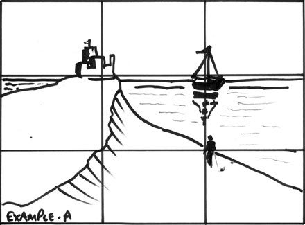
The problem with many angling photographs, and I’m as guilty as the next, is that most of what we shoot is of another angler holding a fish (I’ll have more to say on this later). Often with this type of shot the area surrounding the lucky captor is cut out because the viewer’s eye is meant to focus on the subject, the captor. That’s alright for the odd shot in an article or in a calendar, but often the reader wants a variety of scenes and that means taking pictures of the surrounding areas as landscapes. Of course there are clubs that forbid exposing the swim for fear of the ‘circus’ turning up. I’ve been into photography since the very early 70s and in the 90s I took up art, watercolour in fact although I do dabble in other media. The one big advantage of sketching and painting is that we can move things around. If we don’t want a tree where nature put it we get out what we call our ‘pocket JCB’ and move it in the painting or leave it out. Additionally we can introduce trees and other objects from different views around us so that what we end up with is a more pleasing view. The photographer has to make the best of what is in front of him, if he is true to his pastime and doesn’t use Photoshop or some other image editing software. The Golden Mean When composing a picture you will want to include some feature as the main centre of attention, be it a bush, a person, a boat, whatever. Where you place this in the picture will either make it an interesting composition or something that looks like a holiday snapshot. Artists divide up their paper using a rule known as ‘The Golden Mean’, where A is to B as B is to the whole. The calculation for the Golden Mean is complicated so for the sake of simplicity we use thirds. If you take a piece of paper and divide it into thirds, the points where the lines cross are the general areas where the subject should go.
In example A you see the lines marking out the thirds and in this very simple sketch (I’m not looking for a prize here) you see we have a castle atop a hill, a boat, and a figure on the beach. You shouldn’t have more than two or three subjects and really only one main one. If this was going to be painted then the castle would be pushed right into the background as would the boat, with the figure being brought forward, this is called artist’s licence. This type of composition looks far better than if the main subject was plonked straight in the middle. Note also how the horizon falls just below the top third. Never place the horizon in the middle, always move it towards the upper third or lower third!
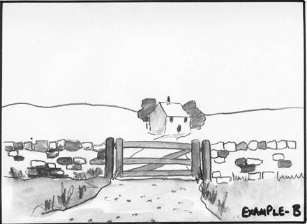
Another fault can be seen in example B. A simple scene again where the horizon cuts straight through the middle of the picture slicing it in two. The house, our main subject, is also very central and makes for a boring composition, a little further to the right would be better. But there is an even bigger problem with this sketch that makes it bad. The wall and gate! A viewer needs to take their mind on a walk through the painting, it needs to go somewhere and here it starts on the path and gets to the gate. There it has to stop because the gate is closed and the wall on either side stops the mind from wandering through. If the gate was open you could continue your journey and the composition may have been saved.
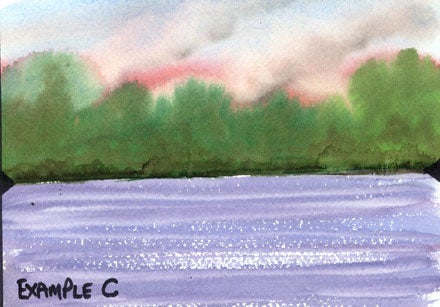
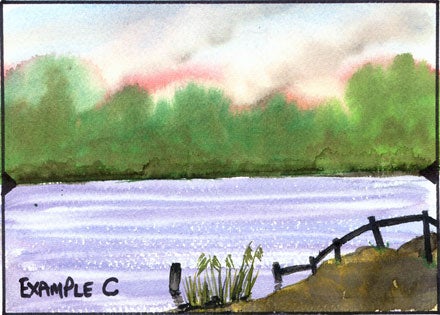
Look at example C, another sketch (yes, it’s painted and not very well, but it’s still a sketch at this point). How many times have you seen photographs of sunsets across a lake to a huge bank of trees and other than a pretty sky, precious little else? First thing wrong with this sketch, the horizon is in the middle again (between the two marks or just above them) despite the tree line being almost three quarters the way up. Next thing wrong is there is nothing between the viewer and the far bank. Not that this stops the mind from crossing water, you can do all sorts of things with the mind and crossing rivers and lakes is no problem. It just looks all so empty.
That’s the problem, but if you took the picture from a little further back, being careful you don’t cover the foreground with bushes and fences otherwise you’ll have the same effect as with the wall in example B. Above I have just included a little land and an old fence (like I say, as artists we can borrow things or make them up) that looks like it got submerged when the lake was created. Because the fence recedes, it helps to show distance and enhances the picture (again though, in this case not a prize winner, I agree.)
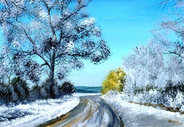
Take a look at this painting of mine, ‘The Winter Road’, now in the hands of a very rich and private collector. Here I felt that the road was a little central so I decided to make the bush to the right more of a feature and being painted predominantly in yellow ochre, it draws the eye and makes the mind want to walk around that corner to see what’s on the other side. Of course, this isn’t a painting lesson so if you came across this scene and wanted to photograph it, you’d probably want to include more of the hedge to the left. At least the horizon is right and the blue-ish snow-covered hill in the distance really pushes the scene back. Beware of bright distracting colours, bright red for instance, they draw the eye.
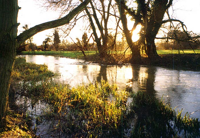
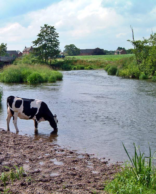
Last one, it’s been on FM before, if I remember. A picture of the River Colne taken contre-jour, meaning literally ‘light from behind’ and here means the light source (the sun) is behind the subject. This is not an entry, but it is quite a pleasing picture if I say so myself. The mind wants to cross the river to the other side, between the trees and either walk along the bank or disappear into the sunset. Also you have some nice ingredients in this picture, old trees, reeds and even the colours of lilac tints (in the water) and yellow (in the sunshine) and they’re what artists call complementary colours and they lend themselves to good pictures. If you want to see some examples of landscapes take a look at the BBC’s site from when they wanted people to send in pictures of Britain. Go to www.bbc.co.uk/arts/apictureofbritain and select your area and preferably rural. The south east has some nice shots in it, but see what pleases you and make notes about the positions of features in the picture, where the horizon is, etc. I can’t, for copyright reasons, copy any onto here and point to the better ones, so it’s up to you. A Few Photography Notes from Graham Some great tips from Jeff that are well worth keeping in mind no matter if you paint pictures or take photographs. For landscapes, ideally, you want the wide setting on a compact camera, or a wide-angle lens (or the wide setting on a zoom lens) on an SLR. Certainly no longer than 35mm, with 24mm and 28mm, being much better. Wide angle lenses offer a greater depth of field (which means both the foreground and the background will be in sharp focus) and they obviously give you a much wider view, meaning it is easier to include that foreground tree or other object that gives the picture that 3D look or perspective.
With the contre-jour (background lit) shots that Jeff mentions it often pays to take these with a hint of flash, known as fill-in flash, just to bring out a little of the detail in the foreground. Few anglers actually use it but most cameras have the facility to increase and decrease their flash output. Have a play with this and see just what a difference it can make; increase the output for lighting up the more distant subjects and decrease it for close ones, especially those of fish and anglers, as this will go a long way to preventing those overexposed highlights such as angler’s faces and the flanks of fish. The best photographic tip I can give is this: When looking through the viewfinder take note of everything you can see, because what you can see on an SLR is exactly what you will take and near enough what you will take on a compact. Too simple? No, not really. It’s this not taking notice of what you can see in the viewfinder that cuts heads off anglers, and doesn’t notice the tree that’s growing out of the angler’s head.
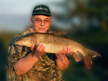
Yet the most common mistake is just poor composition, in that too many photographers just see the subject and place it right in the middle of the frame, with either glaring expanses of useless sky or stretches of boring ground. Move in and fill that frame with most of the trophy shots you take. Remember, you can turn a camera onto its side to take a shot in ‘portrait’ format as well as ‘landscape’ format, even for a landscape! Just use your imagination. Now back to Jeff. Boring Fish Pictures I mentioned earlier about pictures of anglers holding fish and I’d like to tell you now of something that came to my attention earlier this year. As many of you might know I got into a thread on the forum about a new stealth umbrella that converts into a full bivvy. Again, the comments of FM members were the deciding factor (especially those of Cakey – get well soon mate) and as a consequence I bought a JRC model. The box arrived from the supplier, England Angling, and inside was a complementary copy of a carp magazine, BC, or Big Carp Magazine so this is a kind of review. It’s not often that we review a magazine, but why not? It is after all a product that needs to sell itself and magazines demand a share of your money along with rods, reels, baits and other angling paraphernalia. Before I read anything I had a skip through this one (£ 4.25 so not cheap) glancing at the photographs. That’s about where it stayed and I’m not going to count them all, but here are some observations. Cover – bloke holding carp. Front or contents page, two photographs, a bloke holding a carp in each. Next page, four photographs of blokes holding carp, and so it went on. There are a few (accent on ‘FEW’) pictures of other things, bivvies, a reel, a sleeping carper, but in the main, most pictures were of some geezer holding a carp.
As for the articles they seem rather long and with such uninspiring photographs I didn’t feel like I wanted to even start reading them. I got to the article ‘Diary of a Carp Fisher’ written by the editor, Rob Maylin, and thought, perhaps this says something about the type of photographs he wants to see in his magazine. Accompanying his article there are 22 photos of which no fewer than 19 are of him holding a carp, most of them commons and look like they came out of the same jelly mould. Oh, and no background other than a bush, just one showed him fishing and the few others are of fish in a net. Picture titles are – 29 plus, 25lb, 26lb, 27lb, 28lb, 25lb, 28lb, 27lb & 23lb (two in one picture here – JW) ….. and so it went on. For me it is – BORING! Sorry, but that is how I call it, even the adverts are similar with loads of blokes holding lumps. It’s going through my mind, surely this is not the only reason why anglers go carp fishing, is it? Is this really what serious carpers want to see, just pictures of blokes, or the same bloke even, holding fish after fish after fish and, if so, can anyone explain to me how a 27lb common carp can look very different to a 28lb common carp? I don’t like tarring everyone with the same brush so I hope that some of you serious carper chaps are going to start a forum thread on this subject and perhaps explain these things, but if I was thinking of starting carping, after seeing this, I wouldn’t bother! I’ll say sorry now to Rob Maylin, he’s probably a nice guy and I suppose he is selling lots of copies of his magazine as it says ‘volume 19 issue 114’ on the edge. I’m not sure that I find that fact at all comforting though since it tells me they like this kind of boring presentation and that the likes of Coarse Fisherman and FISHINGmagic has it wrong. If you haven’t yet bought this magazine, I wouldn’t rush out to your local newsagent. I cannot honestly recommend it based on it’s current presentation and I certainly won’t be placing a subscription. However, that to me, if you hadn’t already guessed, is my opinion of how not to fill a calendar and I only hope that Graham receives some really startling shots from you all. Good luck everyone. |